Environment

Surrounding Environment

The surrounding environment of the building is that of grand, lavish, traditional Victorian and Georgian houses. The house overlooks a small field and a quiet road. The dark orange brick work blends in well with the surrounding buildings because they are of a similar colour and tone. The building is of a reasonable size which doesn’t dominate the green scenery in front of it and instead co-exists with its environment. The building in itself is very bold and strong but because of the size of this building it does fit in well with its environment and adapts well with its surroundings even though the design is very different. Goldfinger would live in this house for the rest of his life and because this was his home he spent a lot of time considering how it can be both a very innovative architectural design and also compromising his bold architectural design which allows it to be in keeping with the very classic style buildings nearby.

Indoor Environment

The indoor environment of the house is very warm and welcoming. The materials and the colours used, both for the construction of the house and for its furniture and objects, create a pleasant atmosphere that makes the users comfortable when interacting with it. The red objects catch your eye as you enter the building and the pattern created by the red walls you face as soon as you climb the staircase and as you enter the dining room, is overwhelming.

The colour scheme used throughout the house gradually becomes lighter as you ascend through the building with bold, red, glossy paint being combined with dark blue doors, walls, and stairs. On the staircase, rope banisters demonstrate how strong the outer walls are. The shape of the staircase casts bold shadows which draw the eye of the guest upwards to the main reception rooms. Natural light from above and artificial light from below give a sense of invitation.

Living Room

Dining Room

Main bedroom

Platform connecting Goldfinger’s office and the living room

The interior of the house encourages various activities, depending on whether the folding walls connecting the dining room with the architect’s office are open or closed. When they are closed, a cosy family-gathering are is created along with an inspiring working space. When they are open, the spacious room encourages the organization of parties and other social gatherings.

We built a cardboard model of the first floor of the building, showing the dining room (bottom right), the architect’s office (bottom left) and the folding wall which connects them. You can also see the raised platform connecting the office to the living room (top left).

This is the plan view of the model. The column on the top left corner of the picture symbolizes the staircase leading to the first floor and continuing up to the second floor of the building:

These photographs show the process of folding the wall:

The large window allowed the habitants to connect with the surrounding environment and relax in the presence of the green colour. The park on the opposite side of the street probably had a calming effect upon the residents.

View from outside the window

We also showed the part of the large window found in front of the kitchen table, in order to demonstrate the fact that when people looked outside the window, their sight was blocked by its frames.

The furniture and the objects in 2 Willow Road are representative of the time it was designed. The majority of them were designed by Goldfinger himself, so their style is quite similar to the style of the building. The house is decorated with numerous pieces of artwork and design objects as well as books. They reveal the family’s interests and sense of style, but also their preferred activities at the time. They are representative of their lifestyle, clearly showing their interest in art, design, literature and architecture.

Goldfinger’s toy designs

His designs are mostly consisting of cylindrical shapes and components which shows his interest in the use of geoometric shapes in his designs. This is evident in the design of 2 Willow Road as well, since the numerous columns are an imposing component of the facade.Media EnvironmentIn terms of the buildings context, the architect was very cautious about not making such a bold statement due to the complications of its planning permission and because of this Goldfinger didn’t want to offend any residents. At first, people were quite unhappy with the idea of 2 Willow Road being introduced in the neighbourhood. Despite the fact that many artists were living in Hampstead at the time, the reactions towards the creation of the building were very negative. They felt that it would be a disruption to the local environment, rather than a refreshing addition to it.

The Modernist buildings in 1930s Hampstead which attracted Goldfinger to locate his building there:

Isokon Building 1930

    Lytton Cross 1932

    Lawn Road Flats 1932

    Adaptation

    2 Willow Road is a particularly good example of a building which was built ahead of its time. As previously stated, the building was hugely opposed when it was first built but has since then become one of the pioneering  works of the beginning of the Modernist era. Despite lacking the harsh ‘brutalist’ white render which is a common aspect within architecture during this period, this does not subtract from the definitive principles which were applied during the design of this building, yet highlights the sensitivity of the architect. Throughout Willow Road Modernist ideas are witnessed by the realisation of it rectalinear, modular form or the specific manipulation of materials and the result of this is a building which still stands as a site of National interest 80 years later.

    It is fair to say that 2 Willow Road still stands out from its neighbouring houses, although perhaps due to a change in perception about what constitutes ‘great’ architecture, it is not hard to appreciate that it has been designed with care to illustrate a specific set of values and the fact that it stands out is not necessarily a negative factor.With respect to the adaptation of materials it is interesting to note that the red brick facade which Goldfinger chose for the precise reason that it would not stain easily, continues still to remain in fairly good condition. In fact, the whole building remains in good condition and 1 and 3 Willow Road are still very much thought of as desireable places to live. The only damage which is noteable to the outside of the building are the small imperfections noted in the materials section. Inside the building similarly it has been redecorated but not rebuilt in any way. This highlights the quality to which the building was created.

    On the right hand side of the building there is a pub/restaurant garden which maximises the view of the building and the nature surrounding it. This garden is very inviting and allows the viewer to get another perception of the building. The side of the building shows a very normal facade and in terms of architectural design it is not as creative as the front facade. The modern black coloured benches and chairs show a clear divide between the surrounding buildings and nature. Its almost as if all the surrounding area wants to sit inside the natural enviroment and utilise the beauty of the greenery at the park and the plants around the garden.

    Space and Light

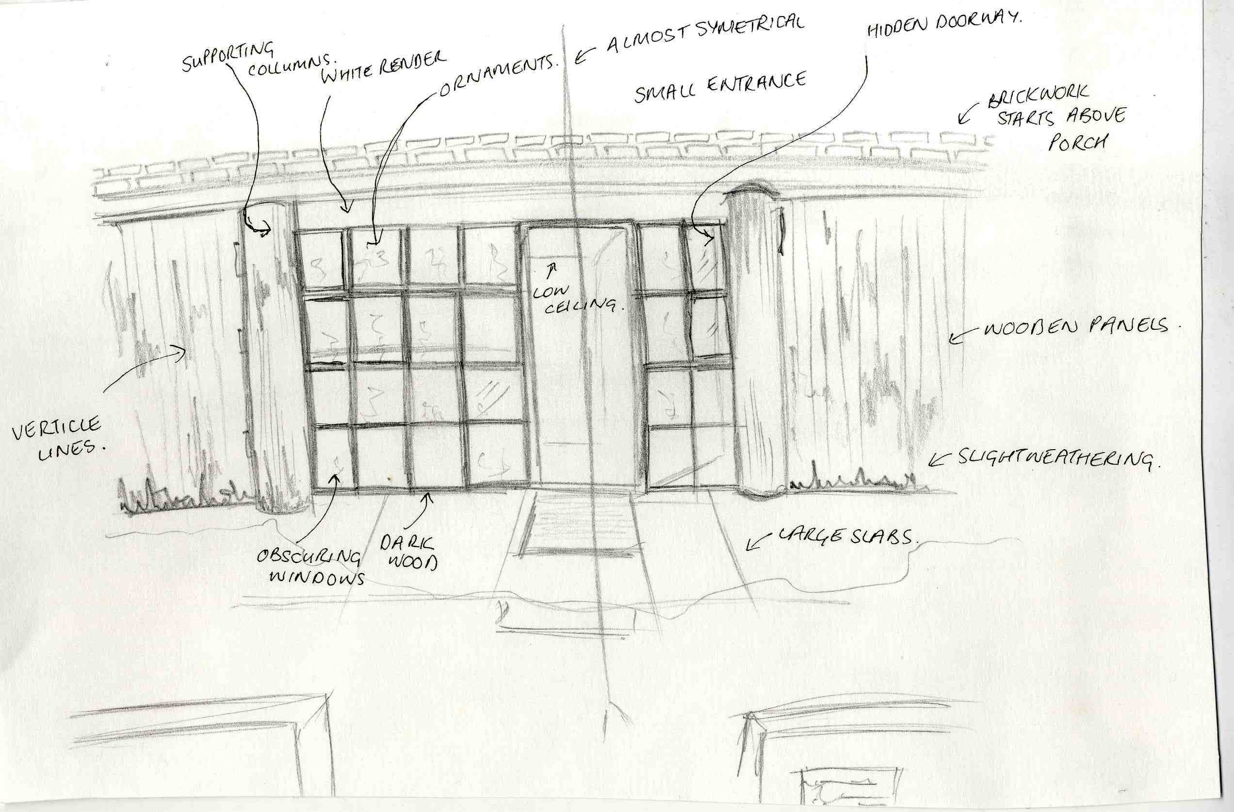
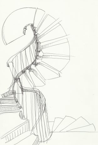
    Upon entering the building it is noticable that the dim-light porch has a low ceiling. This is somewhat unexpected based on the size of the building’s facade, however this is so that light may flow down the spiral staircase from above. This was intended to be inviting and highlight the passage up to the reception rooms.

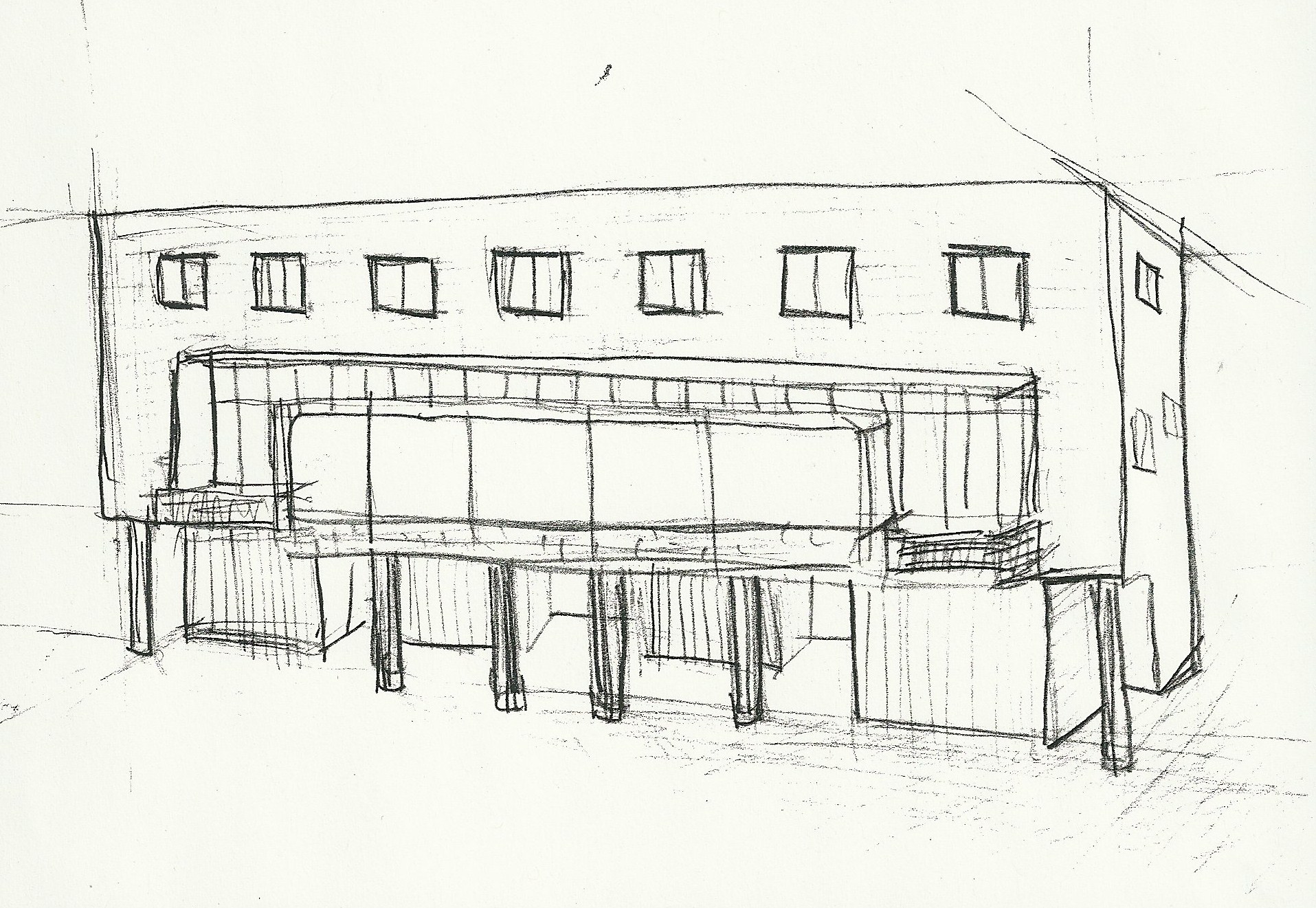
    Upon entering the first floor it also becomes apparent that the ceiling in the porch has been deliberately lowered so that the ceilings of the main reception rooms could be extended. This results in a huge, spacious (especially when the dividers are open), well-lit, first floor which is perfect for guests. The reception rooms and the studio have been deliberately placed on the North side of the house to maximise light. Additionally, the windows on the front façade of the building were specifically designed to increase the light through reflection. As you ascend up through the building the amount of light increases and the minimalist style provides a spacious atmosphere. Furthermore, the use of a spiral staircase minimises the use of space and allows light to flow through the centre of the building. On the third floor there is also a skylight for additional light, perhaps this is why the nursery is located there.

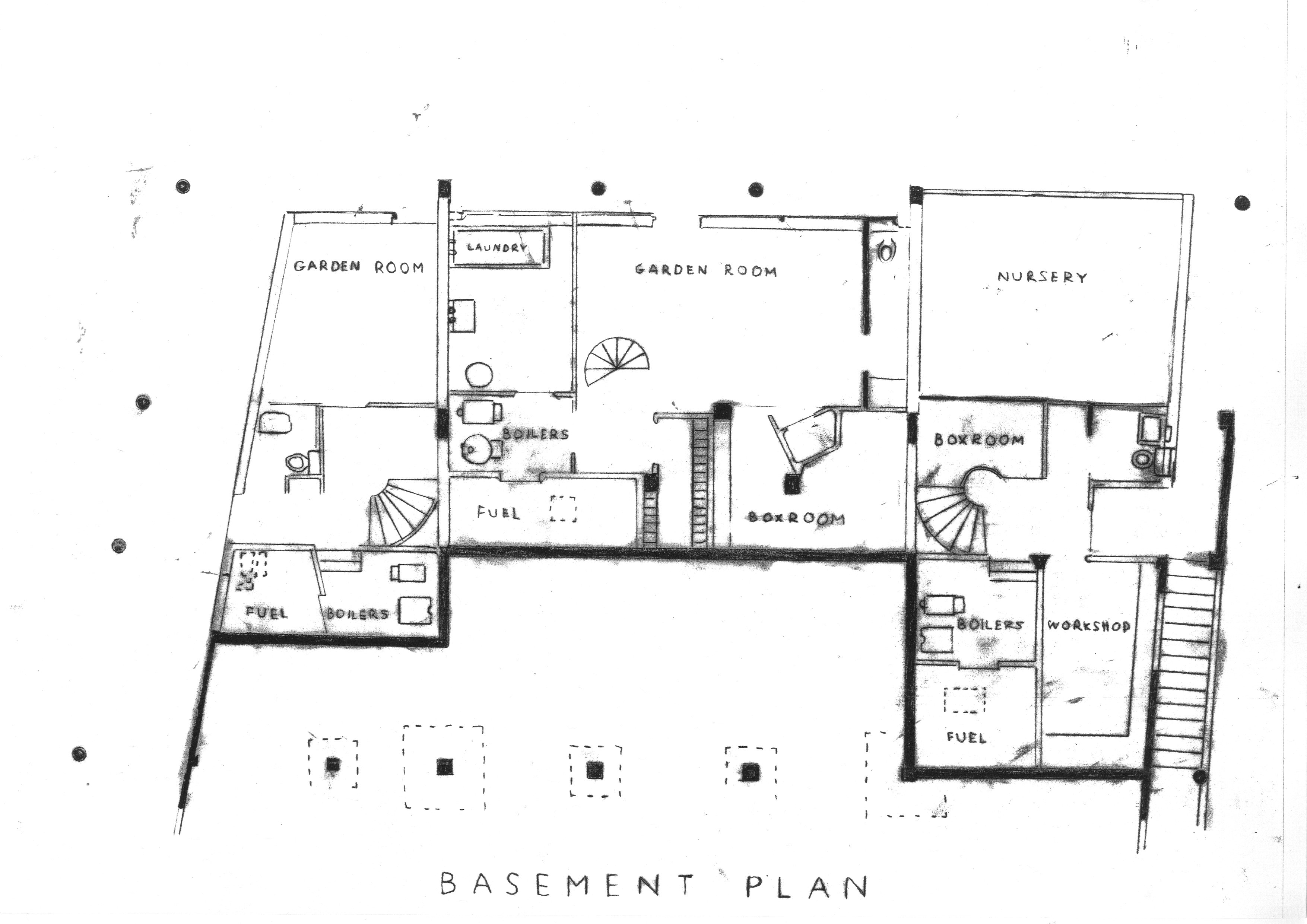
    The storage used in the interior of the house is a key factor when considering space. For example there is a number of bookcases situated around the whole house and all of the furniture is custom made for the Goldfinger family’s possessions. Also the study, which is a small box room was used almost extensively for storage of the family’s work and paperwork. An example of maximising space within this room is are the shelves on the wall which borders the sitting room, which are deliberately built into the wall and form ornamental shelves that protrude into the sitting room. This utilises space as a large rectangular radiator is positioned under these shelves so furniture would not be able to back onto the wall there anyway. Additionally this adds to the aesthetics of the room by hiding the radiator. Moreover 2 large storage cupboards are placed under the large platform leading up to the drawing room, which results due to the varying ceiling height in the front half of the house. Although there is a large concrete slab supporting this platform, the strength of the outer walls mean that the concrete need not cover the whole platform:

    Reaction to weather conditions and impact on the environment

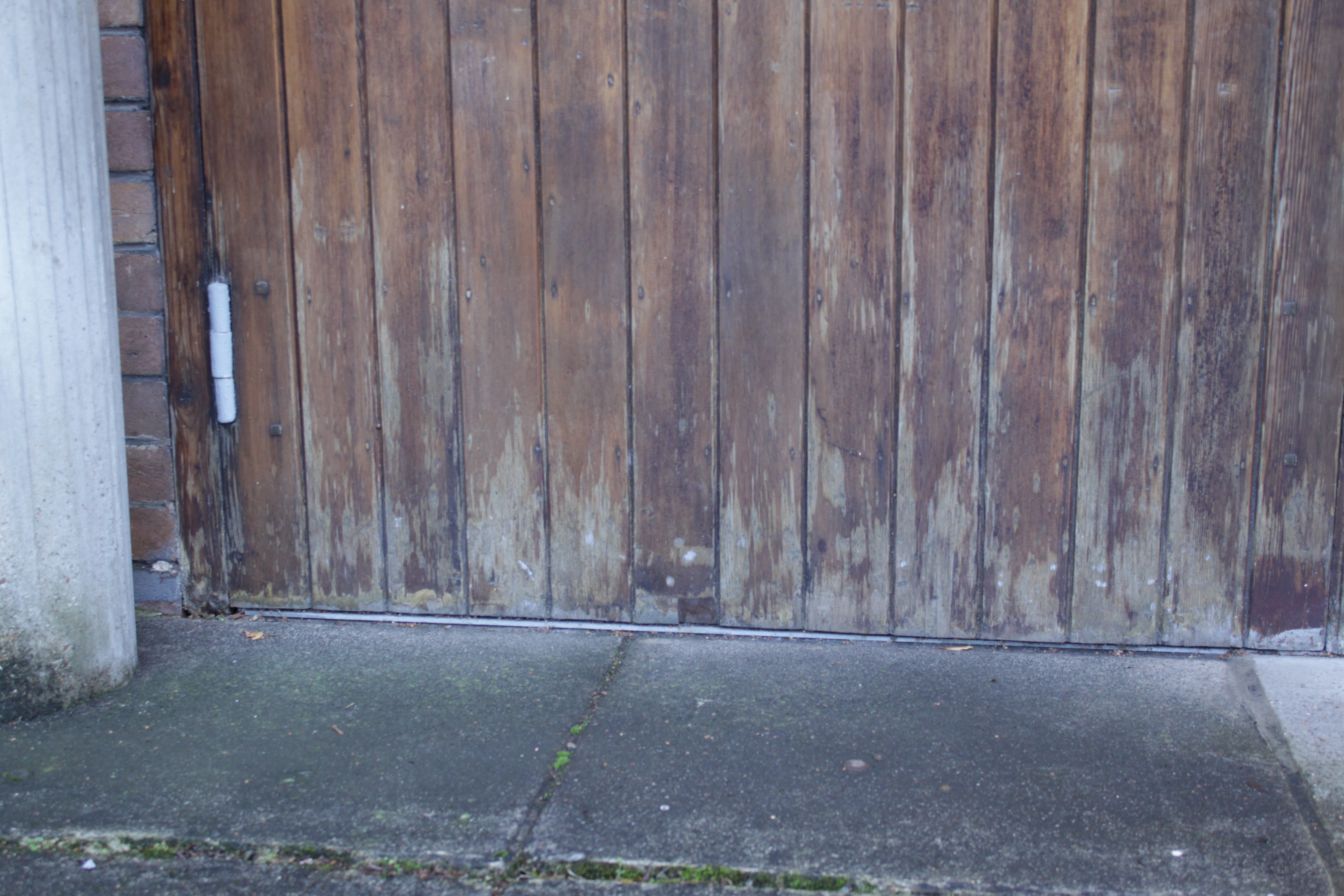
    It is evident from the condition of the exterior of the house that it was built to withstand the change in climate throughout the years. The insulation of the building was very effective as well.

  • Despite the fact that concrete takes a lot of energy to heat up, it maintains its temperature very well.
  • The use of a layer of cork insulation and a cavity wall would have aided this in some way.
  • Double-glazed windows also contributed to the insulation of the building. Surprisingly it was common to use these in most parts of Europe during this period, but not in the UK.

With respect to energy consumption the original coal heating system has been converted to a more environmentally-friendly gas boiler and because the building was well made, not much has been replaced. This means that although it may not have been intended to be environmentally conscious (this was not a major concern in the 1930s), lots of additional materials have not been required and although it may be argued that this is because the building is not being inhabited in, it appears that this is true of 1 and 3 Willow Road as well. The skylight, mentioned earlier, is also an interesting thing to note as it closely resembles the cylindrical skylights (with reflective sides) which are currently used in many houses to maximise light so that artificial light is not required until a later time in the evening. This is interesting as it demonstrated Goldfinger’s forward thinking. As for recycled materials, it is doubtful that any of the construction materials were formed of recycled materials as this was not a current trend, however the furniture which was adapted for the house does show an alternative form of recycling through changing function.

Leave a comment

Filed under Environment

Construction

From the moment we looked at the building, we could tell that its structure was extremely solid. The definition of a solid structure is that ‘Its particles are close together and not far apart’. The variety of heavy, strong materials such as concrete, wood and brick, has an impact on the eye and defies anyone to challenge the building’s strength and durability. It’s a very balanced structure, constructed very carefully to withstand the forces of time.

The building is divided into different levels. These are not only defined by its floors, but also by its forms and materials, which create other structures within the main structure.


The levels are not necessarily just the three floors people are walking on. The facade of the building is divided into levels as well, both horizontally and vertically. In addition, if you look at the building sideways, the levels existing there are obvious.


  • The roof is absolutely flat, avoiding giving an extra level to the building. If it was constructed like the roofs of the other buildings designed at the time, it would break the strictly geometrical appearance of the structure.
  • The balconies and the garage doors which are extruded out of the building facade on its right and left sides are reminiscent of two legs holding up the structure and balancing it perfectly.
  • So are the columns, which seem to hold all the weight of the building. Their distinctive raw concrete appearance stands out, and gives an impression of absorbing all the force created by the bricks on the top part of the building. Since there are four of them, the weight is evenly distributed and this adds again to the geometrical appearance of the structure which doesn’t stop at its face, but it reaches its foundations, it’s bones.
  • The columns also seem to be dividing the building into several rectangles. We can almost imagine them extending up to the roof. They clearly define the boundaries between the three houses as well, without physically separating them, so they play an important part in the division of the structure into levels.
  • Despite the fact that the building is located on a hill, it does not look affected by the tilted ground and maintains its solid appearance.

A section of the building showing its various floors / levels

The various levels made out of different materials that are combined in this structure, create an experience for the person who is looking at it, not only because they were very unusual for the time but also because of the unique way they are coming together, e.g. the smooth transition between the concrete columns and the brick wall. Everything seems to be carefully designed and falls into place. Everything has both functional and aesthetic reasons for being placed in that particular spot.

The architect seemed to have performed a good research before designing this building because we gain the impression that he wanted to design something that would surely be constructed effectively. He was probably thinking about construction during the designing process, because this is a very real structure, a practical structure designed to reality. He designed what he knew could be made. Could he have limited himself? What would the building look like if he had designed something that he didn’t know if and how it could be made?

A cut section of the building

Fabrication

2 Willow Road is a solid, singular structure. This is largely due to the exterior wall which was formed using a reinforced, poured concrete structure. This was a technique which was virtually unheard of during the 1930s and was crucial to the character of the building as a dominating yet gentle form. As a result of this it is thought that Goldfinger had to supervise much of the construction work – a large majority of which would have taken place on-site – himself.

The construction of the exterior wall


To construct the exterior wall, it is highly probable that a steel frame was first created. This would have been made off-site and then delivered pending its installation. Concrete would then have been poured onto this frame and then treated, if necessary to make it more resistant to changing weather conditions. The concrete layer would provide some additional insulation once heated since it absorbs heat over time. The result of this is an extremely tensile structure which can support the interior of the building. The building was built Facing North. This is particularly interesting when considering the construction of the building as it means that the garden and the back of the house receives the most sunlight, however it also means that the front façade receives the most damage from external factors such as pollution. This would obviously have been a major consideration when determining the treatment of the concrete and brick outer layers.

A typical example of a Reinforced Concrete exterior wall

Following this the brick facade and decoration would have been added on the exterior as well as the columns (carved elsewhere) and the wooden panels seen on the lower front facade. Finally doors and windows and their frames would be inserted and finishing touches added. The large steel girders framing the windows on the first floor would certainly have been incorporated into the structure of the building, but would have almost certainly have been made to satisfy plans off-site.

Section. Scale – 1:4

This drawing shows the layers of the interior and exterior walls and they space between levels (ceiling to floor).

The measurements for this image are taken from common dimensions for this type of construction with respect to the materials used and the height and span of the building. Although there may be slight variations, this image shows the approximate proportioning of the building.


Interior

With regards to the interior, a layer of cork insulation was fixed to the concrete to reduce heat loss. This would then be followed by the interior wall, which could then be decorated as desired. It is likely that standard wooden ceiling joists and bearings were used as the outer structure would not need much additional support.

There is a sliding wall in 2 willow roads dining room which can be opened up to his office to create a larger space. This sliding wall means that more light can flood the open space. The architect always considered maximising the most of the little space he had. The sliding wall was closed as he was working in his office and then opened up for when family and friends came over for parties. This way there was a large open space for everyone to gather and celebrate rather than being secluded in small rooms.

Most of the parts and furniture i.e. bookshelves and door frames would have been made in a workshop elsewhere from plans which Goldfinger had created and then installed later. In the guest bedroom there are 2 oak units which are built into the wall, these were apparently furniture which was taken from Erno and Ursula’s previous residence and then fitted into the wall. This is not the only example of pieces of furniture which have been taken from another environment and then adapted in one way or another (turned on their side or cut to fit) so that they were custom made for the Willow Road site.

A sketch showing Goldfingers desk draw

The building’s design reflects Goldfinger’s method of utilising basic proportional systems by means of combining modular squares and rectangles in a repeating pattern. These proportions are subconsciously pleasing to the eye in the same way which is evident in Le Corbusier’s work concerning proportions in relation to the human body. This would most likely have been influenced by his time spent at  the Ecole des Beaux-Arts, Paris. Similarly the construction techniques used reflect the work of his peers, such as Auguste Perret in Paris and would surely have been influenced by the time which they spent together.

Leave a comment

Filed under Construction

Structure

2 Willow Road is building which is dominated and defined by its structure. The structure of the building dominates people’s interactions and lifestyle and commands them how to move around, where to walk or sit, how to live.

Light was a big focus for the architect to consider and the buildings design is based around maximising natural light. The large front window is a clear suggestion that he really wanted to flood the building of light to create a visual effect of the space being percieved as larger. The use of white paint around the window is to reflect as much light as possible into the building as it is a fairly low building which is surrounded by other large buildings which in some cases would make teh buildign very dark but because of the size of the windows and the white paint around the exterior and interior the place is extremely bright.

This is a simple paper model of the large window of the building:

The white frames are clearly demonstrated:

  • The building has a north-facing facade with 3 floors. Each floor is decidedly different to maximise the functionality of the building.
  • The ground floor is formed using concrete columns and slabs. These are all extended up to the top floor, except from the two central ones which stop under the first floor, so that they don’t interrupt the view outside the window.

  • The first floor features a huge rectangular window, supported by a large steel frame. The white frames on the interior part of the window reflect the optimum amount of light without interrupting the view to the outside.

Using a piece of gold wire symbolizing sun rays from different directions, we showed on our model the way they would be reflected on various parts of the white window frames, allowing the maximum amount of light into the building:

  • The building consists of a reinforced concrete structure. This utilises the concept that a sturdy, heavy outer structure supports the building, so that less supports are needed in its interior, providing a greater sense of space and light. The large central spiral staircase in the centre of the building with no supporting beams or banister, shows the immense strength of the concrete structure.

  • The walls of the house are cavity walls with an inner wall of concrete. Just across the top floor, only on the front, the inner re-enforced concrete is strong enough to take the load off the roof.
  • The flat roof creates a dramatic impact and gives the building a “boxy” appearance.  It shows that the architect may have been influenced by structural rationalism, known as “stripping” buildings to boxes. It completes the fully geometrical structure of the house.

The large window of the building was created for numerous purposes:

  • To give a dramatic effect to the building
  • To unify its three parts
  • To provide the house with as much light as possible. Like Georgian architects in central London, Goldfinger has placed the main living area of all three houses on the first floor, where there is a lot of light. To maximise the amount of light entering the house even more, he recessed the glass around the edge of the windows and created white “shelves” which reflect the sunlight.

This is device is used over and over again in Goldfinger’s designs.
He calls it a ‘hyperbolic screen.’

  • The building not only is a very solid structure, but the use of materials such as concrete and brick on its facade, make it appear as one as well. Just by looking at it, we can be sure that it withstands all kinds of forces, whether they are natural (e.g. wind) or man-made (human load).  Despite the fact that it’s located on a hill, it seems to be “sitting well” on the tilted ground!
  • The brick wall in front of the building is another solid structure which defines the boundaries around the house and marks visitors’ entry to the site. It creates a sense of “protection” for the people living in the house, because it distinguishes it from the pavement and the road.

Leave a comment

Filed under Structure

Materials

Following Goldfinger’s beliefs that each material should be used in a way which emphasizes its beauty and retains its essential qualities, the materials used throughout the house have each been chosen primarily on a functional basis.

This is illustrated best by the outer walls of the building, which consist entirely of reinforced, poured concrete. The effect which this has on the interior of the house is astounding, as the strength of the outer walls means that the interior needs very little additional support.

A sketch of the staircase

For example, the staircase which is also a solid concrete structure is ‘supported’ by rope banisters. This is not only aesthetically pleasing, but it also accentuates the atmosphere of strength and sturdiness which permeates the house.  Interestingly the technique of pouring concrete in this way was virtually unheard of in the 1930s resulting in Goldfinger having to oversee the actually construction of the building from start to finish.

This diagram shows the layers of materials which are married together to form the exterior and interior walls.

Another example of this are the screens which separate the main reception rooms, allowing for both an open and closed plan layout as desired. Without the concrete exterior it would not be possible to slide the interior walls around in this way.

The facade of 2 Willow Road is another aspect of the house which is dominated by the use of materials.

Although the style of architecture used was more commonly associated with white render, red brick was favoured for three reasons:

  • It was thought that it would cause less disruption and serve to pacify many of the already outraged residents of Hampstead.
  • White render would have stained quickly during this period due to the smog created by coal-burning, the main source of heating at the time. Brick, on the other hand stains very little in comparison.
  • This decision results in a façade which is significantly more compromising to the surroundings, especially the Victorian architecture already present on Willow Road.

Large wooden panels are also used to decorate the front of the building.

  • This natural material softens the harsh concrete and brick facade and complement the wooden window frames used on the ground floor, especially as it is a material which is not part of the industrial theme, unlike many other materials used. This is effective in the interior of the house as well, because of the presence of oak furniture.
  • These panels introduce a series of vertical lines into the facade which would otherwise be dominated by horizontal ones.

With respect to insulation, the building was, and still is, often cold, as the use of double glazed windows was not widespread during the 1930s. However layers of cork were inserted into the reinforced walls to help alleviate this. Notably, the original heating system is still functioning although it has been converted from coal to gas.

Industrial style materials, especially flooring are common in the house. This also shows the focus on functionality. In the dining room in particular a material named acatyle, previously only employed in industry, lines the floors. It is a thermo-plastic which has been bent at the edges of the room to act as skirting boards. This gives the dining room a clean minimalist feel and functions well as it is hardwearing and easy to clean. Similarly in the front porch Perret style industrial flooring which is designed both for practicality and dramatic aesthetics has been used. In addition to this, large industrial bolts line the staircase.

Overall, the building is very truthful and shows exactly what it is made of. It’s honest to its materials and its users, because everything is applied in its natural form such as the concrete is not even painted. The design of the building shapes its materials and gives them form and a quality that reduced the need for extra finishing to be applied. Paint is only used in the interior walls of the house to provide it with some warmer colours than the grey of the concrete.

It’s a building which influenced people’s architectural ideas and understanding of materials due to the fact that the combinations and the lack of processed  materials were not common at the time. It’s easy to touch and feel the materials because of the scale of the house. This gives it an even more natural effect and it makes us ‘trust’ it and be impressed by its ‘personality’.

Leave a comment

Filed under Materials

Surveying

Currently 2 Willow Road is occupied by National Trust as a showhouse and welcomes numerous visitors every day. It has been carefully preserved and all its interior remains the same from when Goldfinger passed away.

The building was created to provide maximum light and space to its users.

  • Sliding doors provided the option of having individual rooms or large open spaces for events such as parties
  • The kitchen table was placed in the middle of the dining room, so that when people were sitting down, the street could not be seen and that gave them a sense of privacy
  • The large window allowed much light into the house and that made the family aware of the different times of the day and reduced electricity costs
  • The building was also prepared for cold weather as radiators were placed below the window to keep the family warm

Measurements

We measured the parts of the building that were accessible to us using a tape measure. We then counted the number of bricks on the wall and measured their length and width, to calculate the overall height and width of the building.


These are some sketches of our first impressions of the building and its interiors:

Building Plans

Inhabitation and Weathering

The way that people inhabit the building is evident. A car is parked outside the garage of house number 3, something which shows an evolution in people’s needs and way of living. The building cannot be adapted to that. A family nowadays does not only have a single car so one garage is not enough and they are forced to park their second car in front of it!

Evidently the building has been weathered in many ways and its facade has many imprefections. Despite the fact that it seems to remain solid and stable, some of its components have been affected in different ways.

Feedback

  • “Sympathetic, not outrageous, very special building” – family friend
  • “It opened their friends eyes” – Peter Goldfinger, son
  • “The house was full of art” – family friend

We asked 3 differnet people the question: ‘What is your opinion on the building?’

  • “Appealing, attractive. I like the smooth, clean lines and its geometric forms. The combination of wood and concrete is interesting.” – man on the tour
  • “I find it bleak, utilitarian and not interesting to look at. It’s too functional and reminiscent of a 60’s school. I recognise though that it influenced architecture and especially lots of flats.” – woman on the tour
  • “Well I think it’s a monument to a certain point of view. I think that both in it self and in the stuff that it contains, the artworks, are intentionally partisan to the modernism of the late 1930’s, that these architects held to a particular vision very stubbornly. It’s not entirely sympathetic and in its hardness there’s a certain inhumanity about it which is part of what makes it strong and interesting. I admire it, I don’t like it”- artist outside building.

Drawing by a 7-year-old girl passing by

This drawing shows that this girl believes the building is not much different from a typical house. This may indicate how the architect hasn’t gone to far in his design to make it unrecognisable as a place to live.

2 Willow Road Art

This is a drawing of Veronica Bailey’s photoraghy work ‘ 2 Willow Road’, (winner of the Jerwood Photograghy Awards 2003).  She chose series of books from Erno Goldfinger’s library in 2 Willow Road, and visualised them as abstract photos. She didn’t reveal the book title, but by showing the edges of its inner pages, it makes people curious about the story in the book and about where it came from.

Leave a comment

Filed under Surveying